Brand Guide
Airbender Air
Heating & Cooling
This page defines the visual identity for Airbender Air. Use these guidelines to maintain brand consistency across all materials and platforms.
Logo
Logo Usage
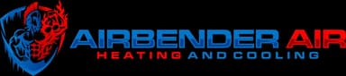
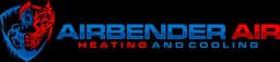
The Airbender Air logo should always be displayed with adequate spacing and never distorted.
On Dark Background
Recommended
On White Background
Acceptable
Small / Favicon Size
Min size: 40px
Logo Lockup
When displaying the brand name alongside the logo, use the following format:
Colors
Color Palette
Our palette is built around the duality of heating (red) and cooling (blue) with dark navy for dramatic contrast.
Brand Blue
#1E6FB8
Cooling services, primary CTAs, trust
Brand Blue Light
#3B8DD6
Hover states, light accents
Brand Blue Dark
#155A96
Active states, dark accents
Brand Red
#DC2626
Heating services, urgency, energy
Brand Red Light
#EF4444
Hover states, light accents
Brand Red Dark
#B91C1C
Active states, dark accents
Dark Navy
#0A0F1C
Backgrounds, hero sections, footer
Dark Navy Light
#111827
Secondary dark backgrounds
Brand Gradients
Use these gradients to express the heating/cooling duality.
Primary: Blue to Red (horizontal)
Overlay: Subtle on dark backgrounds
Cooling CTA: Blue gradient
Typography
Fonts & Type Scale
We use two typefaces: Rajdhani for headings (bold, industrial) and Barlow for body text (clean, readable).
Heading Font
Rajdhani
ABCDEFGHIJKLMNOPQRSTUVWXYZ
abcdefghijklmnopqrstuvwxyz
0123456789
Body Font
Barlow
ABCDEFGHIJKLMNOPQRSTUVWXYZ
abcdefghijklmnopqrstuvwxyz
0123456789
Type Scale
H1 — Page Title
Airbender Air
H2 — Section Title
Complete HVAC Solutions
H3 — Card Title
Residential Heating
Subtitle
Our Services
Body — Regular
Airbender Air delivers expert HVAC installation, repair, and maintenance for homes and businesses. Stay cool in summer, stay warm in winter.
Body — Small
Professional installation of high-efficiency HVAC systems tailored to your space and budget. We handle everything from start to finish.
Components
UI Elements
Standard button styles, badges, and cards used across the brand.
Buttons
Badges
Cards
Cooling Service Card
Blue-accented card used for cooling-related services and content.
Heating Service Card
Red-accented card used for heating-related services and content.
Principles
Design Principles
Duality
Always represent both sides of what we do — heating (red) and cooling (blue). This hot/cold duality is the core visual identity of Airbender Air and should be present in color choices, gradients, and layout.
Bold & Powerful
Our shield-and-warrior logo demands strength. Use bold typography, uppercase headings, high contrast, and confident layouts. Avoid thin fonts, pastel colors, or overly delicate design.
Dark & Dramatic
Dark navy backgrounds create impact and make the blue/red brand colors pop. Use dark sections for heroes, CTAs, and footers. Reserve white/light backgrounds for content-heavy sections.
Trust & Reliability
As an HVAC company, trust is essential. Use clean layouts, professional imagery, and clear calls-to-action. Avoid clutter, excessive animation, or anything that undermines professionalism.
Voice
Brand Voice
How we sound when we communicate with customers and the public.
Bold
We speak with confidence and authority.
Trustworthy
Honest, transparent, no-nonsense.
Powerful
We solve problems with strength and speed.
Caring
Your comfort is our mission.
Guidelines
Do's & Don'ts
Do
- Use both blue AND red in your designs to express the heating/cooling duality
- Use Rajdhani for headings in uppercase with bold weight
- Place the logo on dark backgrounds for maximum impact
- Maintain generous whitespace around the logo
- Use the blue-to-red gradient for primary CTAs
Don't
- Use only one brand color without the other (e.g., all blue, no red)
- Use thin, light, or script fonts for headings
- Stretch, rotate, or distort the logo
- Use pastel colors or overly soft gradients
- Add drop shadows, outlines, or effects to the logo
Ready to See It In Action?
Browse the website to see the brand applied across all pages.